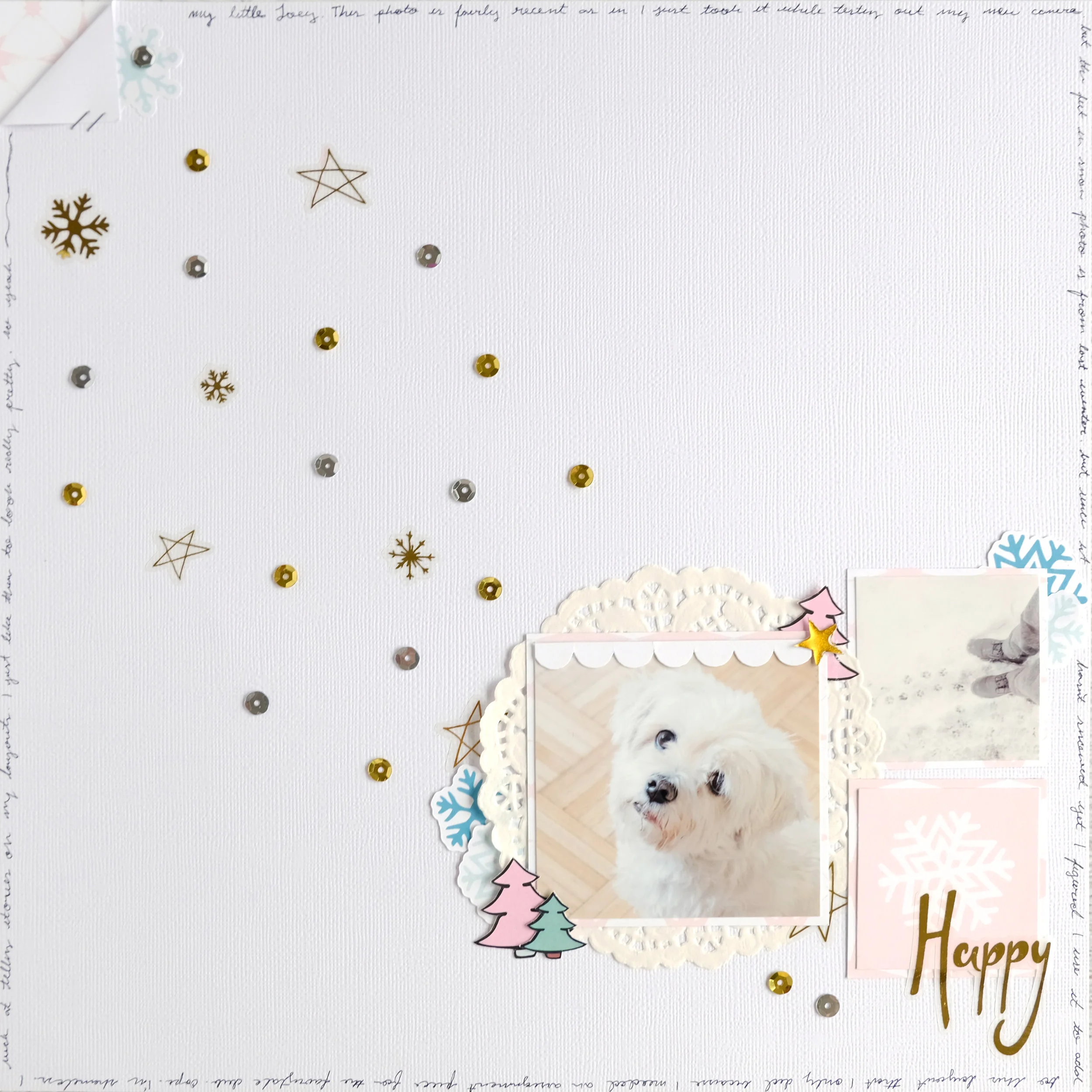
Hey everyone! Tiffany here with a super simple layout using the Jolly kit. I've been in a very minimalistic kick lately and exploring the "less is more" concept. To be frank, I think my work has always had a bit of a minimalist aspect to it. But it's just recently that I've been embracing all the white space. So for this layout, I went super simple and had some fun creating a little layout of my dog Joey with just a few pieces from the Jolly kit.
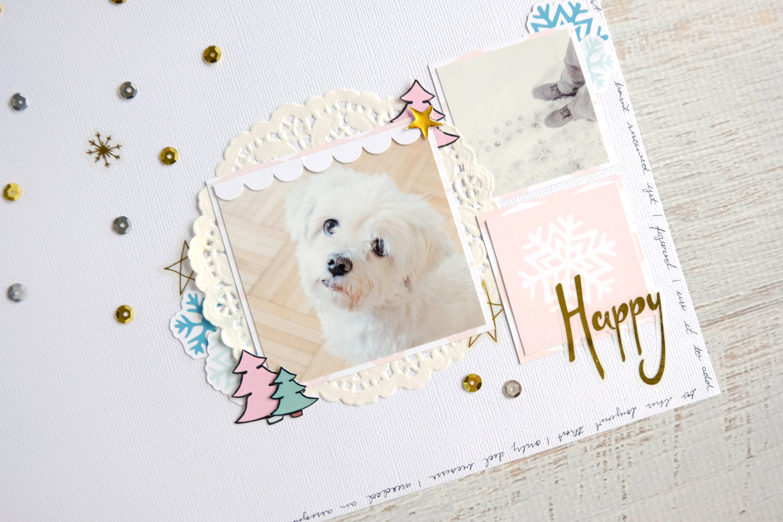
I started with a small little cluster at the bottom right corner of my page. I arranged my main photo of Joey, a smaller photo of his paw prints in the snow, and a squared white snowflake on pink card from the cut apart sheet. I don't usually work with multiple images on layouts, so keeping my squares together in a grid-like layout on my page really helped me put together this page. I backed each square with the same pink patterned cardstock to keep that consistency. I eventually end up repeating that pink pattern at the top left corner in order to keep the piece symmetrical and draw your eye to both ends of the layout.
I layered a white doily behind the photo of Joey before I began embellishing. I mostly wanted to keep to the snowflake pieces from the ephemera pack, but I did end up fussy cutting a few trees from one of the planner inserts and scattered them about my photos as well. I mostly tucked the pieces behind my photos so that they add a pop of color and interest to the page, while still keeping everything looking minimal. I also tucked a few of the gold foil star stickers as well to balance out the gold on my page. I had a strip of paper with a white scalloped trim from a previous project, so I cut out the scalloped bit and added it as a border to my photo. I then added a gold epoxy star from the Take Note kit at the top right corner of the photo of Joey. I finished off this cluster by adding the gold foil "happy" sticker over the snowflake card to act as my title.
I want to highlight my use of the gold and silver sequins that came in the kit and how I created movement and a lot of sparkly interest in my very minimal layout. I love creating pages that go from one corner diagonally to another corner. For this layout, my main cluster is at the bottom right corner of the page. So I used a mixture of the sequins and the gold foil stickers of snowflakes and stars to move the focus from that main cluster to a smaller little detail at the top left corner of the page, where I folded over the white cardstock to reveal a bit of that pink pattern paper. I love doing this technique. You can easily accomplish the same look with ink splatters or enamel dots. But I thought it was such a fun way to use the sequins that came in the kit.
To finish off my spread, I simply added my journaling as the border of the page. I've been loving this look lately, so I did it again on this layout. I love how it adds that special finishing touch to such a simple layout.


