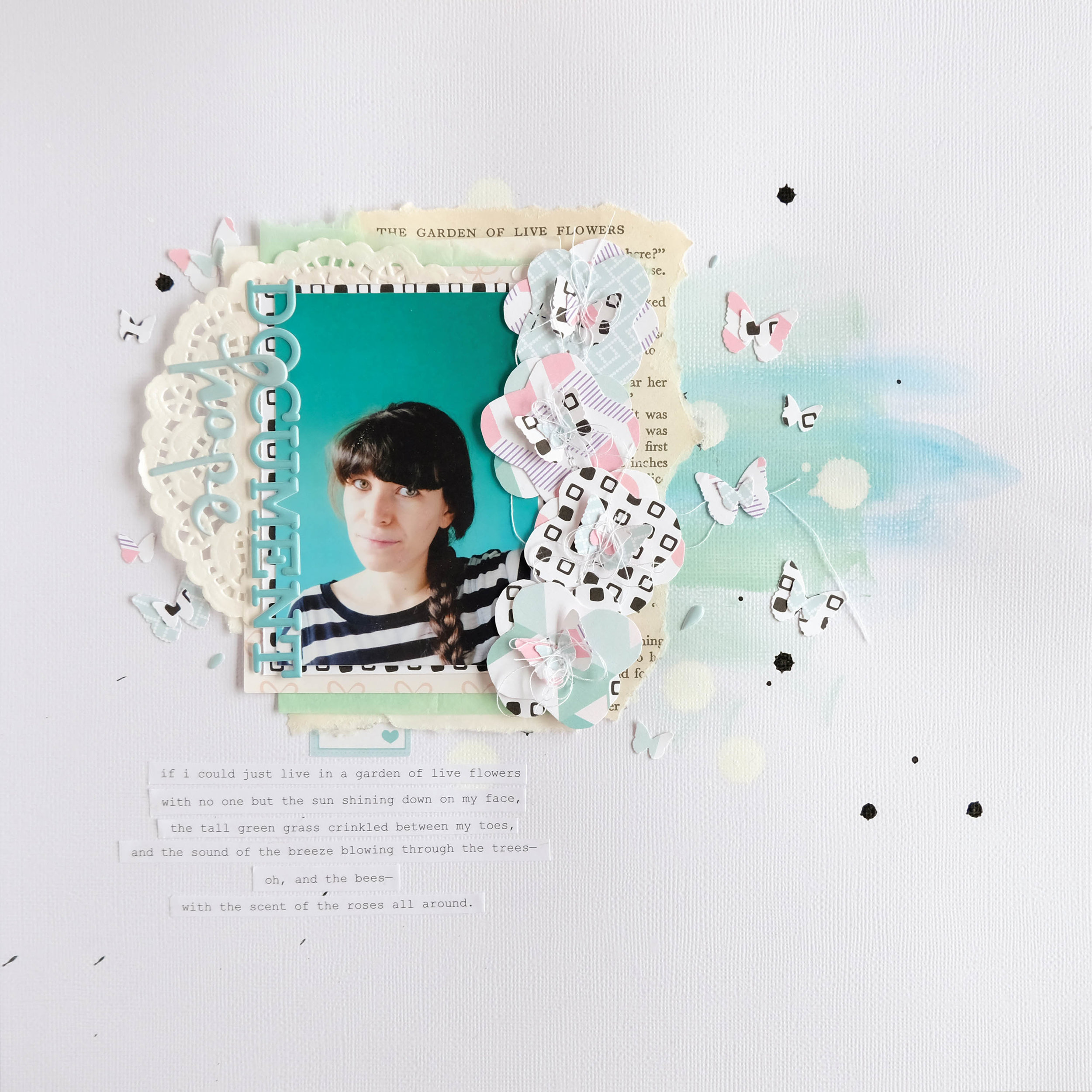
Hey everyone! Tiffany here with a layout using the pattern papers from the Everyday Wishes kit, along with a few bits from Take Note and some packaging from the Girly & Strong kit! I began this layout by pulling out a few of the papers and using a butterfly punch from my stash to punch out some butterflies in two different sizes. I initially wanted to layer them and scatter them about the page, but when I started to gather some other pieces from the kits and my stash to use, the layout sort of changed.
I wanted to use this photo of myself, so after punching the butterflies and layering a small one on top of a big one, I began creating my little layer cluster behind my photo. I layered my photo on top of a black and white pattern paper from the Everyday Wishes kit, then layered that piece over a white paper doily, which I then layered on top of some packaging from the Girly & Strong kit that had light pink bows on it. Behind that cluster, I layered some mint green tissue paper, a piece from a white paper bag and an old book page that I ripped from an Alice in Wonderland book. I really liked the chapter title of that page which read “The Garden of Live Flowers,” so I used that idea of live flowers to build my page.
I set that photo cluster to the side and pulled out some white cardstock to do a bit of mixed media on. I took two different shades of mint green/teal acrylic paint and playfully added some paint to the page. I then added some small black ink splatters and some big white ink splatters onto the page and set that aside to dry. While that was drying, I took the pattern papers I had punched butterflies out of and cut out these wonky four-petal flowers, which I layered to create a bit more dimensional flowers. I added a layered butterfly in the middle of each flower before running them through my sewing machine to stitch them together. I balled up the loose threads in the center of each and bent the butterflies wings up to give the flowers that “being alive” look, which added a lot of texture and dimension to my layout. I then layered those flowers to the right of my photo in a way that makes them look like they are cascading down the side of the photograph.
When my white cardstock was dry and I had my little photo cluster all intact, I glued the cluster down a little off center onto my page. I then embellished it with a few of the extra butterflies I had punched out, so they looked like they are fluttering around my photo cluster. I used the “document” and “hope” puffy stickers from the Take Note kit for my title and placed them on the left side of my photo. I had been having a rough week when I made this layout, so that title combination really stood out to me. I ended up writing a little poem about living in a garden full of live flowers and added that as my journaling at the bottom of my layout. I typed it up and cut them into strips, which I added under my cluster. I also tucked a label sticker from the Take Note kit under my cluster so that there was a little extra mint color poking out from under all those layers.
I really hope you like this little layout!


