Home, Sweet Home with Allie

Hello there! It's Allie here today sharing a layout using the Everyday Wishes collection. Today's page focuses on hand-stitching!

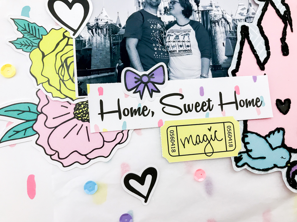
There were so many items in the kit that would look so cute with accent stitching, but I settled on this fun castle from the planner kit! I love the castles Andrea often includes in each kit, because they are so perfect for all my Disney photos!

I stitched around the castle design, and then cut it out to create a beautiful focal point for my page. I used the gorgeous "Dreams Do Come True" paper as my background. I added tissue paper on top of it to help tone down the design and have the photo stand out.

I used a picture from our recent trip to Disneyland, but converted it to black and white so the Christmas colors in the photo wouldn't compete with the colors of the page. 

IMG_6653.jpg

Finally, I finished off with embellishments. There are so many die cuts and stickers that it was hard to choose! I love the way it turned out. I had so much fun using all the beautiful patterns and colors. Thanks for joining me today!

"Spooky" Halloween Layout with Sarah

Sarah here today to share with you my layout using the spooktacular "This is Halloween" kit!!


I started my layout using a white sheet of cardstock, I pulled a few Shimmers from my stash and sprinkled them on the background. I set that aside to dry and started to add layering behind my photo.

I knew I wanted my picture in the center of the page, as that would give me a lot of room to play and layer. I layered some of the papers behind my photo and then broke into my planner inserts and chose a few to add in with the layering.  After I had the layers the way I wanted I decided to bend up the sides of each of the layer.

Once my sprinkles were dry in the background, I went ahead and added my photo and its layers to the background and worked from there. I like to do this a lot - get my photo where I like it and then work the rest of the page from there. I looked through my planner inserts again and decided to cut the cute black cat sitting on the pumpkin out and use it as an embellishment.  I added it to the right side of the photo and slid the cute little Boo heart sucker die cut behind it.

PicsArt_10-25-06.49.29.jpg

I knew I wanted more on the layout, so I decided to add a strip of the purple polka dot paper to the top and a strip of the orange, too.  They tied in well with the plaid paper in the layering behind my photo, and I decided I would add some of the purple to the bottom as well. 

Then it was on to embellishing!! I pulled out the die cut pack and started to play. There were so many cute pieces, I had to reign myself in or I would have used it all! But instead, I pulled out a few pumpkins, some little bats. and the word 'Boo.'

I knew what I wanted the title to be, and the Boo would be great to mix in. So I added the Boo to the upper left side of the layout with a little pink pumpkin and then added the rest of my title with thickers from my stash, so it says 'Boo @ the Zoo!' That's where we took the picture. It was a fun-filled night for adults at the zoo with lots of fun, scary zombies and some cute things made out of hay.

Well I went on and added the bats around the title and then moved to the bottom of my layout. I added two little pumpkins and that adorable tag that says, 'xoxo.' Finishing off my layout. I added some stitching and ruffled up the edges of the rest of the papers.

Thanks so much for coming by and seeing what I created today!