Water Color and Peonies with Aimee

It’s Aimee again! Today I got messy with the “Beautiful Dreamer” Kit and just had to share with you!

peonies_01.jpg

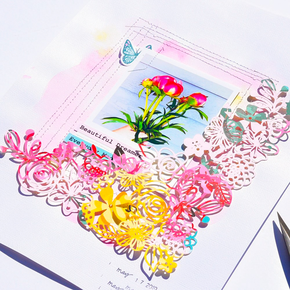
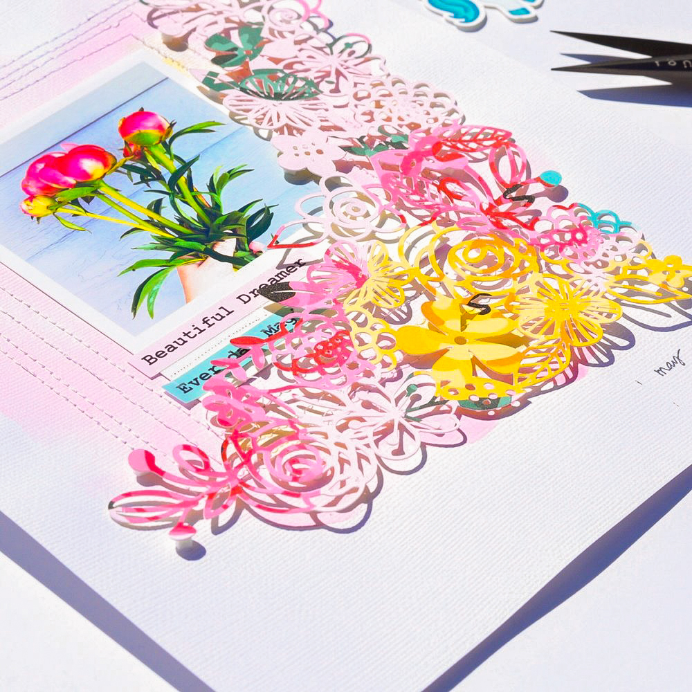
 I went way out of my comfort zone with this one! I mixed water colors with a fancy cut paper and machine stitching.

peonies_02.jpg

 I started this layout off by using a cut file from Kim Watson, you can find the file here.  I scaled down the file and cut it using the “Her Name is Aurora” 12x12 paper. You guys, this paper is so beautiful and the decision to cut it was so hard to make!

 I printed my photo to look like a polaroid picture.

peonies_03.jpg

 I marked where I was going to adhere my photo and I water colored around the outside of those marks.

Now, I really don’t know how to water color. I just moved some color and water on the paper and this is the final look! This is WAY out of my comfort zone.

peonies_04.jpg

 After it dried, I placed a heavy book on my paper and let it dry overnight {I don’t care for how the paper gets wavy after you have put paint/water on it - another reason why this is out of my comfort zone}

peonies_05.jpg

 I adhered my photo to my paper and then stitched around the photo several times.

I used some stickers from the sticker sheet to complement the photo, and then I placed my cut file over my photo, adhering it with 3-d foam adhesive.

peonies_06.jpg

 I also dated the layout with my date roller stamp

7.jpg

 How often do you leave your comfort zone when scrapping???

 XOXO Aimee

Aimee's Santa Visit

Hi all Aimee here, hoping you had a great Christmas and New Year! Today I’m sharing a layout I made using the “December Dreams” Kit.

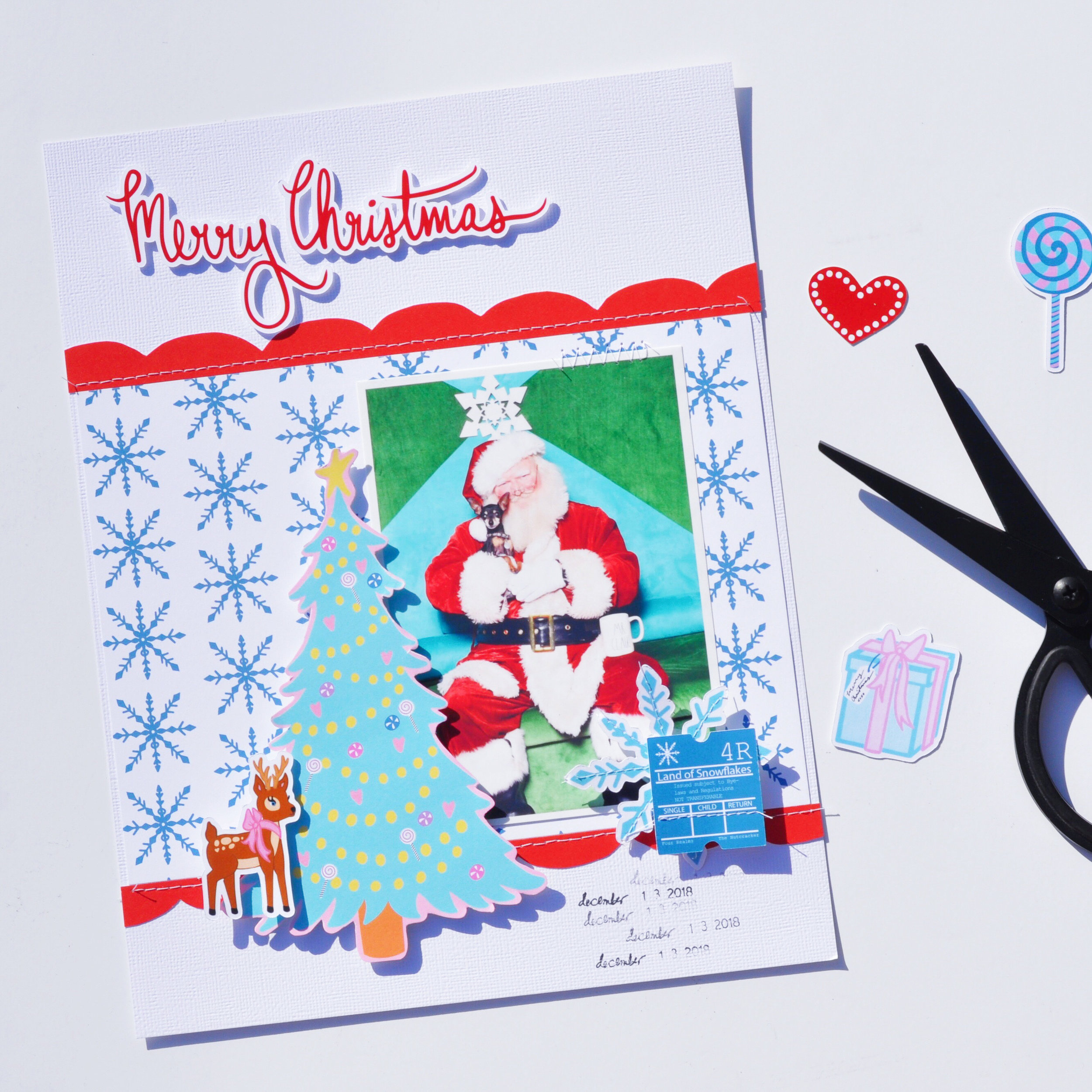
I took my little dog Jager to see Santa at the Mall and of course I had to scrap it!

My layout is an 8.5 x 11 and I used an A5 dashboard from the December Dreams kit as my back ground. Who knew that an A5 dashboard fits perfectly onto an 8.5 x 11 layout!

4.jpg

I fussy cut the tree from another one of the A5 dashboards. Using some 3-d adhesive foam, I layered it over my photo. (Don’t forget that cute little deer that’s layered over the tree.) I also cut some scallops from “Land of Snowflakes” and stitched them to the top and bottom of that A5 dashboard.

2.jpg

When I was stitching the scallops on to my cardstock, I also stitched on a snowflake and “ticket” from the die cut pack for fun. I also used 3-d foam adhesive to pop them up and layer them on top of my photo.

Next I took “Merry” + “Christmas,” and, using more 3-d foam adhesive, I placed these die cut words at the top of my page.

To finish off my layout I used a date roller stamp to date the visit to Santa.

Do you take your pets to see Santa?

XOXO Aimee

Aimee's "December Dreams" Layout

Hi there, Aimee here! Hope you are having a wonderful Monday, lol. Today I’m sharing a layout using “December Dreams.”

12-3-18.jpg

While I was out of town for the Thanksgiving holiday, my husband and I drove around and found some fun places to take photos. We came across this half-decorated tree, and I was all, “husband STOP this is a perfect photo opp!”

So, with fashionable style we took photos with a half decorated tree with a tub full of ornaments behind us. I highly recommend learning how to use the timer on your camera and have a tripod handy. I took some pretty awesome photos this way.

Keeping it simple as always I used my go to 8.5 x 11 white cardstock for my base. I cut a piece of “Oh Christmas Tree” just smaller than my cardstock. I layered my photo on one of the A5 dashboards, and cut it down to mat my photo.

3.jpg

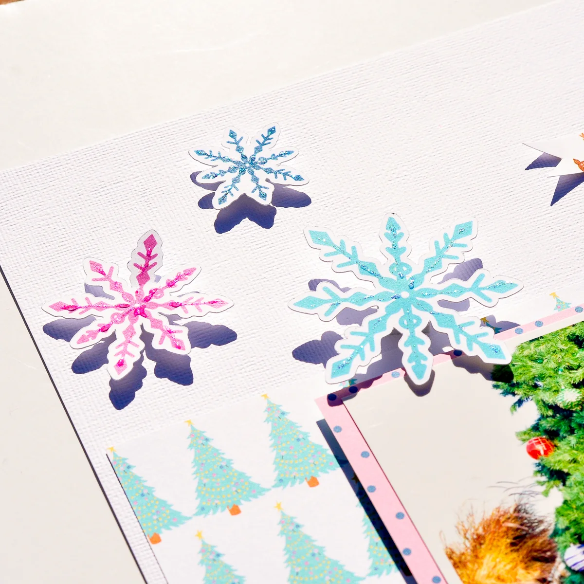
I used 3-d foam to pop my matted photo of the page. I fussed around with some die cuts and settled with the 3 snowflakes, the Nutcracker, Sugar Plum Fairy and of course the Christmas Tree.

I also used the printed strip at the bottom of the 12x12 sheet of “Oh Christmas Tree” to create the ribbon flag, and layered it with the “joy” flair.

Of course, I stamped my layout with the date the photo was taken {Date roller stamp from Heidi Swapp}.

2.jpg

And to take my layout to the next level I add sparkles to my die cuts. I dug into my old supplies and pulled my box of Stickles, I haven’t used these in ages. I love this extra sparkly touch!

I love this silly photo of my husband and I. Do you every stop at random places to take photos? Thanks for stopping by the blog today!

XOXO Aimee

Kellie's 6x8 Halloween Layout 2: The Spookquel

Kellie here with you today to share a layout I created using the Magical and Mischievous kit that I love to bits! This kit truly has everything and not just for your Halloween crafts as I've shown as we don't celebrate it down here in Australia, per se

2018-10-28 10.46.57.jpg

I feel that using a white cardstock background works so well to then add as much colour as you like. I scrapbook in the 6x8 size. Snap chat to the rescue for a photo and in black and white which, again, makes using colour even better.

2018-10-29 11.09.46.jpg

Layering in a layout is my favourite thing to do. Often I have to stop myself from layering too much, if there is such a thing! I've used the 12 x 12 pattern papers from the kit and with the ephemera also.

2018-10-29 11.09.59.jpg

I've used the acetate web sheet also on the silver side as the other side is purple, which is awesome to have two different colours.

I'm really happy with the end result, and after two layouts, two cards, and a mini album layout, I still have enough of the kit left over for so much more spooky crafting! What are you going to create with your kit?

Carolee's Traveler's Notebook "Magical and Mischievous" Layout

Hey everyone! Carolee here with a new traveler’s notebook layout for you today using the new Magical and Mischievous kit Andrea created for Halloween!

My hubby and I took a quick afternoon trip to Disneyland to check out all of the decorations and Halloween items in the shops. We found this adorable popcorn bucket and picked one up. This picture makes me giggle. Someone told me that Ryan looks like he’s trying to get someone to try the poison inside! So, I figured using the Magical and Mischievous banner would work great as a title on this layout!

First up, I cut a piece of paper down so that I had two TN-sized sheets. Next up, I wanted to layer several papers underneath the Instax photo I printed. I love using the A5 inserts for this since the patterns are a bit smaller. I added a touch of pink as the mat and then haphazardly cut a bit of purple to go under that. Last, I added the title banner and glued it down to the page.

The cauldron square from the Hello October paper couldn’t have been more perfect so that went opposite the picture. I just glued that down and added a couple of staples to add a bit of gold to the layout.

Next, I wanted to add some orange. I used the pumpkin bucket die cut but while I was looking through, I saw the poison apple so I added that in there as well. Finally, I added some of the sequin mix to the page to add color and shine to the whole thing. I really like how well this quick and easy layout came together. I hope you have as much fun with the collection. Until next time, happy crafting!

Kellie's 6x8 Halloween Layout

2018-10-10 17.18.01

Hi all, Kellie here with you again this month to share a layout I created using the NEW kit, Magical and Mischievous.  I started in paper crafts only scrapbooking, then moved to cardmaking and then back to scrapbooking and pocket page albums.  I love everything paper crafts.  Now let me show you the layout I created.

2018-10-10 17.20.55

I like to create layout in the size 6x8.  It's a size I tried when a friend of mine, Emma, showed me her amazing work and I just loved the size.  I've always found 12x12 a little too big for me, while 9x12 isn't overly large, but 6x8 is just perfect.  I've used a instax photo from a snap chat photo I took of myself around this time last year.  It fitted in perfectly with this kit as we don't celebrate Halloween down here in Australia.  Although even that wont stop me from creating a few more layouts with this kit.

2018-10-10 17.17.42-1
Starting with a plain white cardstock I love to layer when creating a back drop. So I grabbed the pattern paper to create a background.  It's either I create a background or plain white space, one extreme to the next when it comes to my style sometimes.

2018-10-10 17.15.06I then grabbed out the ephemera die cuts and layered up.  This is my FAVOURITE part when it comes to creating a layout.  Sometimes I have to stop myself as I just want to add it all.  I'm really happy with the final result and the way the layout turned out.  It gave me the itch to create even more layouts again.

2018-10-10 17.17.52

Want a little tip?  You might even do this yourself.  Often when creating anything I lay everything out, move things around till I'm happy with it.  Then of course you have to stick it all down, which means taking it all off.  Now this is where I can forget what went where, get distracted, walk away and come back and think, ugh where did it all go?  I take a quick snap on my phone and then I have a reference.  This also works well when you can't decide should that pumpkin go there or the black cat?  Take a snap and you'll get your answer.

Laura's "True Fairytale" Layout

Hello everyone! It's Laura here, and today I am so thrilled to be back sharing my second layout this month, this time using a cut file.

I loved all the designs, but the woodsy, leafy look of this frame in particular stood out to me.  In 2014 I was lucky enough to do some traveling in Europe, and I have been using the Hello Beautiful kit to scrap some photos from my time in Germany.  In this case I used a photo of my mom and me at a castle we visited.  

I decided to cut out the frame as large as possible on a piece of 12x12 paper, and weave in some roses I cut from the patterned paper in the Hello Beautiful kit.  I used the pink ledger paper as my background and added a bit of mixed media water color to the background.  

To really make the page special I took a photo of the castle we visited and edited it in photoshop so it was a black silhouette, and made my own custom die cut to line the inside of the frame.  My goal was to make it match the black border and look like the vines were growing up and around the outline of the castle.  The mixed media helped blend it in with the frame.  

A few embellishments from the kit helped finished off this special page, and I'm happy to have another part of this trip documented in my scrapbook.

Adding Patterned Paper to Project Life with Carrie

Hello Everybody!  Carrie here, today!  Since Valentine's Day is right around the corner I thought it would be fun to share a spread in my Project Life album inspired by love and hearts and unicorns!!  

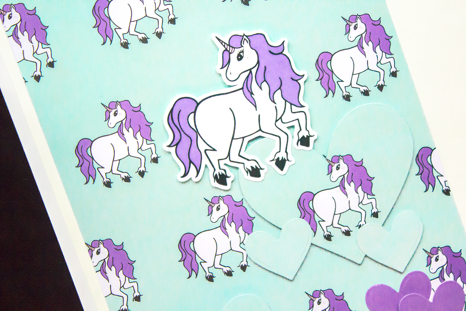
This spread is also one example of how I like to add patterned paper into my 6x12" Project Life.  I don't know about you, but patterned paper might be my favorite scrapbook product, and since there are so many gorgeous papers in the Everyday Wishes Kit I'll take any chance I can to add it in ; )

As you can see the left side of the page is a full 6x12" photo, but you could easily replace it with three 4x6" photos if you like and I think that would also look great.  On the right side I used the lovely unicorn patterned paper from the Everyday Wishes kit to fill up the whole page.....and I think I should mention, I don't always embellish on top of a full patterned paper page.  Sometimes I only add a single embellishment in the middle or a number or a word.  However, for this spread I knew I wanted to add in hearts since I love my daughter to bits, along with the phrase "You're a limited edition" to go along with my quirky photo.

The kit came with these awesome black and white word die-cuts and two of them were "you" and "are".  So I decided to change my phrasing just slightly to "You are a limited edition."  I used some older Dear Lizzy thickers for the rest of the words, and I like how they are gold with pink underneath to compliment the rest of the purple on the page.  To help make it all stand out, I also cut some white bits from one of the patterned papers and layered them under a few of the thickers with holes.

The unicorn theme was perfect for this spread since I was talking about a "limited edition", so to emphasize it I popped up the unicorn die-cut towards the top of the page.  Next, I started cutting a bunch of different hearts out of matching papers from the kit.  For the solid blue and solid purple, I used one of the cut apart sheets, and for the hearts with the unicorns on them I used the second half of the background patterned paper.  They are all layered with most of them popped up.

At this point I knew I was pretty much done but wanted to add in a little more black.  So I found this little blue script heart die-cut outlined in black and tucked it into the "y" in you....and that's it!  I know it's simple, but I don't make the time for proper layouts these days.  So a photo, pretty paper, a simple phase, and some hearts in my Project Life album feels great!

Thanks for taking a look, and I'll see you next time.  
Cheers! Carrie

Everyday Memories with Enza

Hello, everyone! Enza here, and I'm back today with a new layout featuring the amazing Everyday Wishes kit.

PHOTO Main - Jan29-2.jpg

I love using die-cuts and dimensional elements on my pages. They add texture and color, and create lots of interest, especially when grouped together to form clusters. I started by backing a heart wreath cut file with several patterned papers from the kit. I was not sure how I wanted to add more dimension to it. I thought about adhering it down with foam adhesive, which is what I usually do, but ended up creating a shaker in the center of the wreath instead. Shakers are such a fun element and very simple to make. Here, I just adhered a piece of acetate to the cut file before gluing it down. Easy peasy. I love how the colorful sequins move around and make this layout more interactive. To jazz up the background, I also splattered some mist on it, making sure to use colors that coordinated with the papers in the kit.

For the photo, I created several layers behind it with patterned paper and embellished it with many die-cuts. The ticket stubs come from one of the cut-apart sheets. I simply stapled them together and used hearts in coordinating colors for a tone-on-tone look. The word die-cuts are perfect to create titles. There are so many of them! Again, I used foam adhesive to give it dimension.

To finish the layout, I added a small cluster of embellishments on the opposite side of the photo to balance it out.

That's all for today, friends. I hope you enjoyed reading about my process and will feel inspired to use some of these tips to add dimension to your next scrapbook layout.