Carolee's Traveler's Notebook "Magical and Mischievous" Layout

Hey everyone! Carolee here with a new traveler’s notebook layout for you today using the new Magical and Mischievous kit Andrea created for Halloween!

My hubby and I took a quick afternoon trip to Disneyland to check out all of the decorations and Halloween items in the shops. We found this adorable popcorn bucket and picked one up. This picture makes me giggle. Someone told me that Ryan looks like he’s trying to get someone to try the poison inside! So, I figured using the Magical and Mischievous banner would work great as a title on this layout!

First up, I cut a piece of paper down so that I had two TN-sized sheets. Next up, I wanted to layer several papers underneath the Instax photo I printed. I love using the A5 inserts for this since the patterns are a bit smaller. I added a touch of pink as the mat and then haphazardly cut a bit of purple to go under that. Last, I added the title banner and glued it down to the page.

The cauldron square from the Hello October paper couldn’t have been more perfect so that went opposite the picture. I just glued that down and added a couple of staples to add a bit of gold to the layout.

Next, I wanted to add some orange. I used the pumpkin bucket die cut but while I was looking through, I saw the poison apple so I added that in there as well. Finally, I added some of the sequin mix to the page to add color and shine to the whole thing. I really like how well this quick and easy layout came together. I hope you have as much fun with the collection. Until next time, happy crafting!

Aimee's Halloween Layout

Hey all, it’s Aimee!

Are you a planner girl or a scrap girl? I am 100% a scrap girl, but I love planners. But really I’m just a paper lover. Today I’m sharing a mix of both worlds, using the “Magical And Mischievous” Happily Ever After kit!

I used the “October Calendar” A5 divider as my focal point for my scrapbook layout. Say What? That’s right. I used an A5 divider on my layout. I even got to play around with my stamps, as if I was a planner girl.

I first stamped the dates on the A5 divider. I then matted my photo with another A5 divider, the super cute purple ledger paper.

I added some foam adhesive to the back of the matted photo and adhered it over the calendar, just so you could see some of the dates.

I really wanted to use one of those pom-pom paper clips, but they are a bit puffy for a scrapbook layout. No problem, I just trimmed the back of the pom-pom to make it lay flat on my layout. I then slipped the “Magical and Mischievous” banner under the paper clip {I first added a bit of adhesive to the back} and then stapled the paper clip in place.

I journaled on some plain cardstock with my typewriter. I made sure there was enough space between each line/sentence so I could cut them a part. Once I had cut my journaling a part, I adhered it to my layout. I then used foam adhesive to adhere the candy and pumpkin die cuts.

And to finish off my layout with a little pizzazz, I faux stitched around the A5 divider with a white gel pen.

Do you ever use supplies that weren’t intended for scrapbooking/planning?

XOXO Aimee

Kellie's 6x8 Halloween Layout

2018-10-10 17.18.01

Hi all, Kellie here with you again this month to share a layout I created using the NEW kit, Magical and Mischievous.  I started in paper crafts only scrapbooking, then moved to cardmaking and then back to scrapbooking and pocket page albums.  I love everything paper crafts.  Now let me show you the layout I created.

2018-10-10 17.20.55

I like to create layout in the size 6x8.  It's a size I tried when a friend of mine, Emma, showed me her amazing work and I just loved the size.  I've always found 12x12 a little too big for me, while 9x12 isn't overly large, but 6x8 is just perfect.  I've used a instax photo from a snap chat photo I took of myself around this time last year.  It fitted in perfectly with this kit as we don't celebrate Halloween down here in Australia.  Although even that wont stop me from creating a few more layouts with this kit.

2018-10-10 17.17.42-1
Starting with a plain white cardstock I love to layer when creating a back drop. So I grabbed the pattern paper to create a background.  It's either I create a background or plain white space, one extreme to the next when it comes to my style sometimes.

2018-10-10 17.15.06I then grabbed out the ephemera die cuts and layered up.  This is my FAVOURITE part when it comes to creating a layout.  Sometimes I have to stop myself as I just want to add it all.  I'm really happy with the final result and the way the layout turned out.  It gave me the itch to create even more layouts again.

2018-10-10 17.17.52

Want a little tip?  You might even do this yourself.  Often when creating anything I lay everything out, move things around till I'm happy with it.  Then of course you have to stick it all down, which means taking it all off.  Now this is where I can forget what went where, get distracted, walk away and come back and think, ugh where did it all go?  I take a quick snap on my phone and then I have a reference.  This also works well when you can't decide should that pumpkin go there or the black cat?  Take a snap and you'll get your answer.

Aimee's "Magical and Mischievous" Halloween Layout

It’s FRI YAY! Aimee here with a layout using the new Halloween Kit “Magical and Mischievous!” Oh, My Goodness you guys, this kit is so fantastic. I knew it was going to be super cute from the previews, but it’s even better in person.

ACS_0320.jpg

To create this layout, I used a piece of 8 ½ x 11 white cardstock. I trimmed the transparency down to 5 ½ from its original 11 inches. I centered the transparency on my cardstock. I left a white border around my photo and matted the photo with some black cardstock.

Once I knew where I wanted the transparency to be adhered (before I adhered it) I ran my cardstock through my typewriter and added the location and date to the cardstock. And of course, I can never center my typing (anyone else have this problem?)

Using foam adhesive, I centered my matted photo on to the transparency. I then used a tape runner to on the back side of the transparency under the photo so you don’t see the adhesive. I also stapled the transparency with my mini stapler to secure it to the cardstock (transpaencies are known not to stick well that’s why I added these extra steps. The moon and purple pumpkin are on top of the staples)

Once the photo and transparency were in place, I fussed around with the die cuts and lined them up across the bottom of my photo. I wanted the die cuts to layer over one another, and POP off the page. I used foam adhesive to achieve this look by using multiple pieces of foam on a single die cut. Once my die cuts were in place I took a black pen and did a faux stitch/scribble around the bottom of the die cuts (and around the top of the moon) giving the die cuts a faux shadow

To finish up the layout I sprinkled the star die cuts across the top of the page to create a “night sky”

ACS_0317.jpg

I so super happy with how this layout turned out!

I can’t wait for this kit to hit the shop so I can order another die cut pack!

And doesn’t my Niece make the cutest “spooky” witch? It’s so hard to believe that she is now 13

XOXO Aimee

Laura's "True Fairytale" Layout

Hello everyone! It's Laura here, and today I am so thrilled to be back sharing my second layout this month, this time using a cut file.

I loved all the designs, but the woodsy, leafy look of this frame in particular stood out to me.  In 2014 I was lucky enough to do some traveling in Europe, and I have been using the Hello Beautiful kit to scrap some photos from my time in Germany.  In this case I used a photo of my mom and me at a castle we visited.  

I decided to cut out the frame as large as possible on a piece of 12x12 paper, and weave in some roses I cut from the patterned paper in the Hello Beautiful kit.  I used the pink ledger paper as my background and added a bit of mixed media water color to the background.  

To really make the page special I took a photo of the castle we visited and edited it in photoshop so it was a black silhouette, and made my own custom die cut to line the inside of the frame.  My goal was to make it match the black border and look like the vines were growing up and around the outline of the castle.  The mixed media helped blend it in with the frame.  

A few embellishments from the kit helped finished off this special page, and I'm happy to have another part of this trip documented in my scrapbook.

A Traveler's Notebook Layout from Aimee

Hi there, It’s Aimee. Today I am sharing a page from my Traveler's Notebook using the “Hello Beautiful!” kit.

I’m not a huge TN gal, but tend to make pages from time to time. I do love the small scale though. It’s basically scrapping a tiny photo on a tiny page. And since I love all things tiny this is just perfect for me. I also love being able to use my toy printers to print photos.  To create this tiny layout, I used the pink ledger and a scrap from the geometric patterned paper, and I made the pink tag out of the beautiful rainbow 12x12 paper.

I just layered them altogether with a piece of washi tape. With foam adhesive “popped” up the “magic” die cut word over my photo and tag. I added some jute to finish of my tag. I also used a pink bow and some butterfly wood veneer to complete this tiny layout.

After staring at this TN, I think the only thing I’m missing is the date!  I often realize these little details long after my project is done, photographed and I’m here writing my blurb. Do you ever finish a project and add to it days later?

Single-Photograph Layout with Aimee

Hi there, it’s Aimee and today I am sharing how you can make a boy-friendly layout with the “Hello Beautiful!” kit.


Even though The Fairytale Club tends to be pretty girly, I was able to create a semi-masculine layout and document a recent trip.  I used a photo of my husband that I recently took on our trip to Charleston SC.  Using a piece of 8.5x11 white card stock {my got to}, I matted my photo on top of the teal geometric patterned. I cut it down from one of the 12x12 sheets in the kit.

Once I figured out where I wanted my photo and matting to go, I ran my cardstock through my printer and printed my journaling straight on to my white cardstock.

The back ground of the photo kinda had a forestry feel, so I layered the woodland creatures with different thicknesses of adhesive foam over my photo and matting.

I absolutely love using the strips at the bottom of the 12x12 papers. Here I layered one under my photo and on top of my matting.  I then stapled with my mini stapler 3 corners of my photo and matting. I then was able to slip one of the blue bird stickers under the top left corner of my photo.

Now for the title. I used some foam adhesive on the die cut words “Hello” + “Beautiful”. The two words just fit on my 8.5” wide cardstock.

I love how I was able to create a masculine layout out of this kit.  Have you tried making a boy friendly layout with any of The Fairytale Club kits?

Keeping It Simple with Aimee

Hi there, it’s Aimee. I’m so excited to be sharing my very first layout with a kit from The Fairytale Club! 

For those of you who don’t know me or my scrapping style, let me introduce myself.  My style has evolved over the years and continues to still. Right now, I am in the “white space” phase. So, my layouts tend to be minimal and created mainly on white cardstock. I consider myself a traditional scrapper, and 8.5x11 layouts have been my go to lately. 

Since I am currently traveling, this is a super simple layout due to the fact that I have minimal tools and gadgets with me (like my sewing machine for instance).

I created this layout with a piece of the 6x8 pieces using the “b” side (black & white polka dots for the win!) I trimmed it down to fit just inside my 8.5” piece of white cardstock. I also used tiny staples to look like they are holding down the patterned paper to the white cardstock.

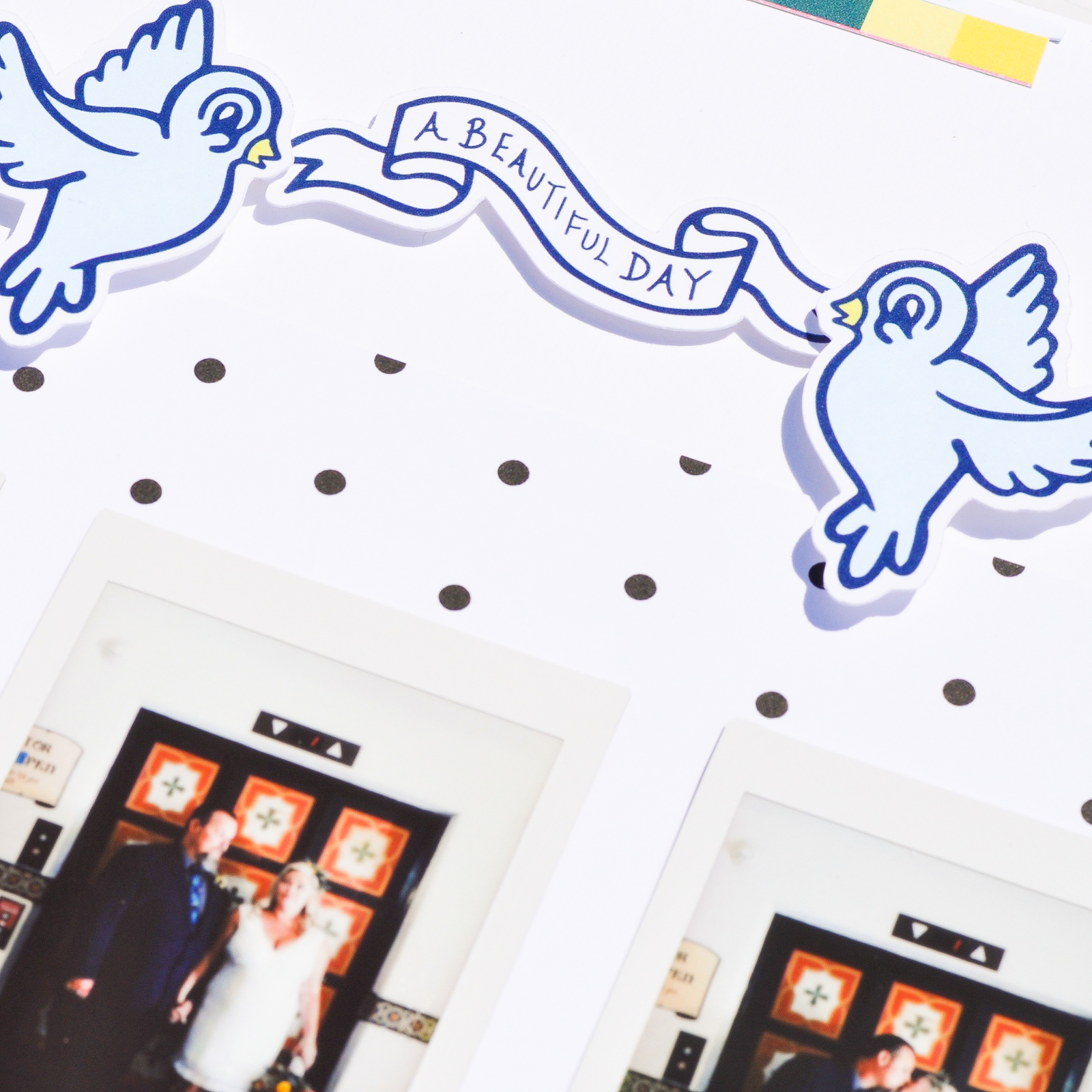
I printed 3 photos from my courthouse wedding (in Santa Barbra) with my instax share printer. 
I layered the “fairytale” die cut word, geotag, birds, and flag banner with 3-d foam adhesive over my photos and patterned paper. 

To create the top and bottom paper piecing (or header & footer), I used the scraps from when I trimmed down the 6x8 paper and the manufacturer's strip of one of the 12x12 sheets. I then used the bow sticker to layer over the paper piecing.

I would have loved to have stitched the paper piecing, but since I don’t have my sewing machine I used tiny staples to give it a finished look. 

Thanks for stopping by The Fairytale Club Blog today!

Adding Glitter Splatter with Carrie

Hello Everybody!  It's Carrie here with my first post using the gorgeous Hello Beautiful Kit, as well as my first post as an official design team member : )

Today I'm sharing a 6x12 layout that I've now placed directly into my 6x12 Project Life album for April. Yay!!  We recently did a little exploring here in Seattle, and I snapped a few photos from a visit to a lovely Japanese Garden.  The actual photo on the layout was taken just outside the gardens, but it is currently sitting next to photos from inside.  It was such a beautiful place to visit I'm already looking forward to going back!

To start out creating this layout I took the colorful striped sheet of 12x12 paper from the kit and cut it down to 6x12.  Then, I used some watered down Martha Stewart Crafts Pearl Paint and splattered it all over my paper using a paintbrush.  Before the paint dried I added this ultra fine iridescent glitter to the paint to create a "glitter splatter".  To keep the glitter from rubbing off once it dried I sprayed a clear archival sealer all over.  Works like a charm every time!

Next, I added my full size 4x6 inch photo directly onto the paper and popped it up using a rectangle piece of foam paper I trimmed to size using scissors.  Since the green in my photo was a different shade then the green on the paper it was an easy decision to place it there.  

With my husband and daughter in the background of my flower photo I decided to use the "you are my favorite" die cuts from the phrase die cut pack.  I also popped them up but this time used foam adhesive.  I think having the pink words next to the pink paper creates pleasant movement for the eye, so that was another easy choice for me.

At this point I decided that the large butterfly from one of the planner inserts would be a great statement piece, so I fussy cut it out.  To add a little more interest to the butterfly I used yellow and lime green Stickels to color in a little here and there.  At first I was worried about there being too much glitter, but the background splatter is so subtle that it ended up working out just fine.

Before attaching the butterfly I ended up using embroidery thread along two lines at the top and one at the bottom of the layout.  To make the process as quick as possible, I used my speedy sewing machine to do the hard part of making the straight lines of holes in my paper.  Then, I just matched up the different shades of blue and yellow and embroidered while I watched some Netflix.  Because my layout is so busy but yet still somehow simple, adding in the matching thread adds that little extra element without it being too much.

To finish the page I added my butterfly, popping up the edge of the wings with foam adhesive and that's it!  All in all other than the photo, I think my favorite part of the layout is the glitter splatter.  I haven't used that technique in a while and I just love the way it pops through the different elements on the page.  I hope you enjoyed today's post, and I'll see you next time!

Everyday Memories with Enza

Hello, everyone! Enza here, and I'm back today with a new layout featuring the amazing Everyday Wishes kit.

PHOTO Main - Jan29-2.jpg

I love using die-cuts and dimensional elements on my pages. They add texture and color, and create lots of interest, especially when grouped together to form clusters. I started by backing a heart wreath cut file with several patterned papers from the kit. I was not sure how I wanted to add more dimension to it. I thought about adhering it down with foam adhesive, which is what I usually do, but ended up creating a shaker in the center of the wreath instead. Shakers are such a fun element and very simple to make. Here, I just adhered a piece of acetate to the cut file before gluing it down. Easy peasy. I love how the colorful sequins move around and make this layout more interactive. To jazz up the background, I also splattered some mist on it, making sure to use colors that coordinated with the papers in the kit.

For the photo, I created several layers behind it with patterned paper and embellished it with many die-cuts. The ticket stubs come from one of the cut-apart sheets. I simply stapled them together and used hearts in coordinating colors for a tone-on-tone look. The word die-cuts are perfect to create titles. There are so many of them! Again, I used foam adhesive to give it dimension.

To finish the layout, I added a small cluster of embellishments on the opposite side of the photo to balance it out.

That's all for today, friends. I hope you enjoyed reading about my process and will feel inspired to use some of these tips to add dimension to your next scrapbook layout.